
layered acrylic ink, gold leaf, and varnish on amate paper
21.5 x 87 inches
edition of 12

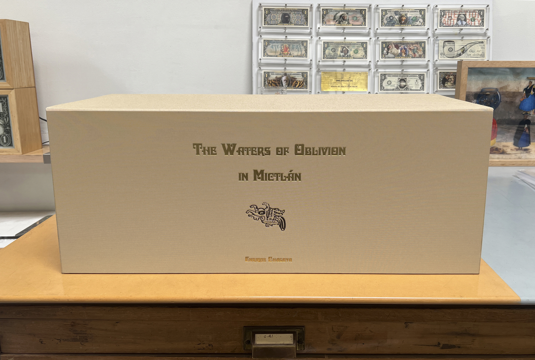
The Waters of Oblivion in Mictlán is the third codex by Enrique Chagoya published by Magnolia Editions in the summer of 2021. The first two codices were folded in the style of a pre-Columbian codex, but this third edition is not folded – letting its energetic parade take place without interruption. Chagoya explains that the work is perhaps a mix of a traditional amate codex and a “lienzo,” usually painted by an indigenous artist on canvas or linen right after the conquest, and that Mictlán means the sacred land of the dead in ancient Náhuatl, the language of Nahua cultures like the Aztecs, Toltecs, and Tlaxcaltecs. Donald Farnsworth notes that the work’s title emerged “as we were discussing the river Lethe, in Hades; a spirit drinks from the river and forgets his life on earth.”
There is a familiar quote by James Joyce to the effect that history is a dream from which we are trying to awaken. Chagoya refers me to another quote from an anonymous Nahua poem published by historian Miguel León-Portilla in his book Canciones Mexicanas (Mexican Songs): “Life is a dream, then we wake up.” The poem reflects “an ancient view of life and death,” the artist writes, “in which life is illusory; when we die, we awake and celebrations follow, as reflected in the joyful portrays of the dead by José Guadalupe Posada (skeletons dancing, having a feast, on their bikes, and so on).” Personally, I like to think of history as a great pool of quicksand into which we are all slowly being sucked like dinosaurs in La Brea. In The Waters of Oblivion – as in all of Chagoya’s prints – history seems akin to what a cast of characters represents to a director, a palette of colors to a painter, or clay to a sculptor: merely raw material to be shaped and reshaped. Chagoya’s imagery moves freely between different centuries, even exploring alternate outcomes: its author is a time-traveler who privileges and seeks not power or money, but hilarity.
The Waters of Oblivion mingles imagery from European etchings with Mayan and Aztec figures from pre-Columbian books, most of which were burnt by a single priest in the 16th century. Besides the four extant Mayan books in Madrid, Dresden, Paris and Mexico City, there are only about 19 books from the Mixtec-Zapotec areas that survived the destruction of the conquest. These books are now dispersed in various libraries and museums in Europe. In The Waters of Oblivion, the world seems to have forgotten its past – or at least, the cards of fate have been shuffled. The dominant empire is uncertain and the future is a colorful mix of European and Latin American influences (as well as Asian, African, and Native American figures).
The edition’s surface has an uncanny texture. Farnsworth describes the evolution of the complex printing technique used to achieve this effect:
At the onset, we envisioned printing on amate, the traditionally pounded bark proto-paper used to make Mayan and Aztec, Mixtec-Zapotec codices. Because of this porous (and sometimes fragile) handmade support, we used a flatbed UV acrylic printer to accommodate the surface with the printer’s tenacious ink set. Using modern and ancient tools and techniques at our Oakland, California studio/workshop, a novel, jewel-like appearance took form as the codices progressed – a rather sweet surprise for Enrique and myself.
Hand-applied gold leaf added to the aesthetic and better communicated the greed and horror of the brutal reign of terror brought by the Spanish conquest of the Mesoamerican empires. In preparation for gold leaf, we printed six layers of varnish in the shapes and location of the elements upon the absorbent amate. Once the sticky varnish was in place, Tallulah Terryll carefully placed, tamped, and brushed thin leaves of gold onto the varnish.
Choosing the darker values from within the overall image, we created a heightmap – a grayscale image that defines the high and low profile of the raised image. The heightmap was then printed in nineteen layers of varnish (each succeeding layer tapering, forming a pyramidal profile). This buildup of ink-film thickness differentiated the darker areas from lighter values. Finally, the full-color image was printed on this texture buildup, resulting in a raised, braille-like look and feel.
In floating banners suggesting the delivery of an important message, The Waters of Oblivion lampoons the often pompous and impenetrable language surrounding the complex issues addressed in Chagoya’s work. His compositions actively resist an overly simplistic need to make sense – whether of the imagery, or of history itself. In the case of particularly confusing and colossal events, there is simply no syntax – visual or otherwise – that could make sense of human history. Instead, we can find some joy, and some big laughs, in its complexities. The Waters of Oblivion invites us to accept and enjoy a plurality of meanings in a way that liberates both the figures that play across the page and the minds of its audience.
– Nick Stone
show prices
Prices and availability are subject to change without notice.The copyright of all art images belongs to the individual artists and Magnolia Editions, Inc.
©2003-2024 Magnolia Editions, Inc. All rights reserved. contact us